A first design tool should help you finish something useful this week, not bury a simple social post under unfamiliar menus. Design tools for beginners work best when they make layout, text, images, and colour less intimidating without making every decision for you.
This guide compares Canva, Figma, VistaCreate, and Adobe Express through real first projects, including posts, flyers, simple brand materials, and early app or web screens.
It suits students, small-business owners, creators, and anyone who wants clearer visuals without starting with complex software.
Begin With the Work You Need to Finish
Start with a task, not a brand. A café menu, school notice, sale graphic, presentation slide, or mobile-screen sketch needs different controls and different levels of precision.
Write down the final format, audience, and deadline before downloading anything. Those details reveal the project requirements and prevent tool overload before you begin.
Posts, Flyers, and Simple Promotions Need Fast Structure
For social graphics, posters, invitations, menus, and short presentations, choose an editor with a correctly sized canvas and easy text, image, and export controls.
Templates can speed up a draft, but they should remain a starting structure for your own message and a learning aid for seeing how hierarchy and spacing work.
Website and App Ideas Need a Different Kind of Practice
An interface project asks you to arrange screens, show a button state, explain a path, and gather feedback. You do not need every professional feature immediately.
Start with one login page, product card, or checkout flow, then improve it after someone tries it. This work needs screen-by-screen thinking and clear user paths, not decorative effects.
Use Each Platform for the Work It Handles Naturally
The tools overlap, but their easiest starting points differ. Choose one based on the work you want to make, the time available, and whether someone else needs to review it. A sensible match reduces early frustration and gives you room to grow after the first projects.
Canva Is Often Easier for Everyday Visual Content
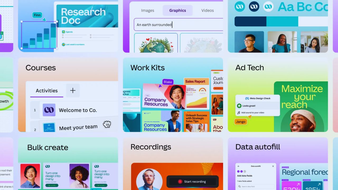
Canva can suit beginners making social posts, presentations, flyers, posters, and small-business materials. Its ready-made formats let you focus on wording, images, contrast, and spacing before confronting a blank canvas.
Popular templates can make different brands look alike, so change the message and visual choices. Use it to practise clear communication rather than template dependence.
Figma Is Better for Interface and Team Feedback
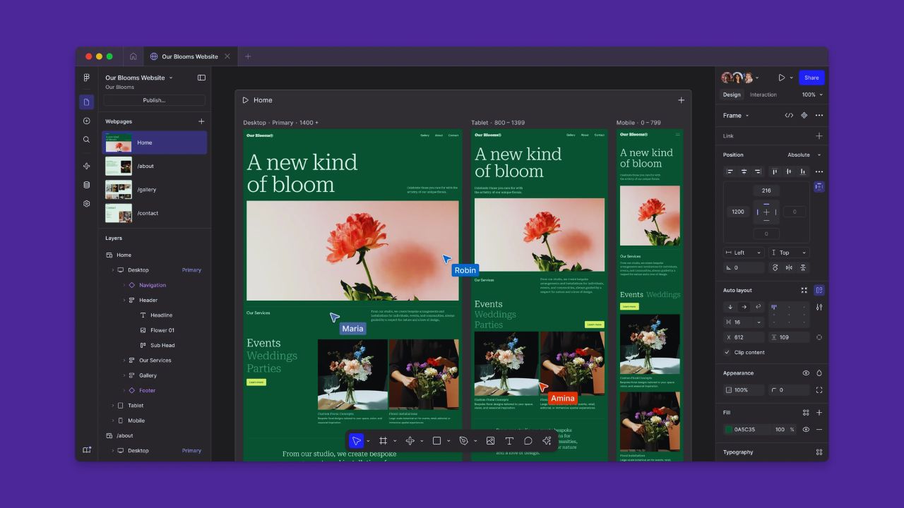
Figma may fit when you want website pages, app screens, dashboards, or clickable flows. Its frames, layers, components, and comments can feel technical, yet they reflect how digital products are often reviewed.
Keep the first file small: one page, repeated elements, and a simple user path. That teaches layout relationships and useful feedback without turning a first exercise into a full product build.
VistaCreate Can Help With Fast, Visual Campaign Pieces
VistaCreate may suit a creator or small business making promotional graphics, animated posts, or a short campaign without starting every layout from zero.
Test whether the available formats match your audience and whether you can change type, images, and timing without adding clutter.
A fashionable template will not always suit a school notice or local sale. Prioritise appropriate visual tone and readable information, especially on phone screens.
Adobe Express May Fit Mixed Content and Adobe Workflows
Adobe Express may be worth testing when you create posts, flyers, short videos, photo edits, and simple brand assets in one week. It can offer a lighter route into an Adobe-centred workflow, but its value depends on the output you actually need.
Try it on a real assignment before paying or moving your materials. Look for repeatable tasks and available features, not the assumption that a familiar software name improves work automatically.
Also Read: Best Products Ranked Without Hype
Test Before You Build a Habit Around One Tool
Feature lists do not show how a platform feels after the fifth edit. Make the same modest project in two tools: a square post, event flyer, class notice, or product graphic.
Give each trial thirty minutes and note where you hesitate, what you can finish, and what creates unnecessary steps. That gives you hands-on evidence instead of marketing impressions when choosing.
Use a Trial That Includes Everyday Editing Tasks
During the trial, do more than type into a template. Replace an image, adjust a colour, align a heading, resize the layout, export the file, and find it later.
These actions reveal whether the interface supports your rhythm or hides important controls behind menus. Test on mobile if you expect to edit away from a computer. A first platform should make basic edits manageable and repeat projects less stressful.
Keep the Final Check Short and Specific
Before subscribing or moving files, compare only details that shape your weekly work. Keep the check tied to your actual goal and real constraints:
- Can you finish one useful design alone?
- Does the free plan cover your main formats?
- Do file sharing and exports fit your workflow?
Templates Are Helpful Until They Replace Your Judgment
Templates can show spacing, alignment, and logical text order, which is useful in early projects. They become less useful when you keep original wording, force content into the wrong frame, or pile on fonts and effects.
Treat every layout as a draft that needs a purpose. The lasting skill is knowing what to remove and what to emphasise when the information belongs to you.
Make Changes One at a Time
Changing the photo, font, colour, animation, border, and spacing together makes it hard to see why a design improved or became busy. Work in order: clarify the message, establish a focal point, adjust space, then choose visual details.
Save a copy before experimenting so you can compare versions. This builds visual judgment and repeatable habits faster than endlessly browsing templates.
Pick One Place to Practise, Then Reassess
The right beginner tool is the one you will open again next week. Make three small pieces in the same platform, such as a social post, flyer, and visual explanation, then review what took too long or looked unclear for clients, classmates, and the regular content you publish each week.
Learn contrast, alignment, whitespace, and readable type before buying more features. That turns first attempts into useful experience and makes your next tool choice more informed as projects become demanding.